
More Than Just a Color: Visual Cues for Color Blind Users
#35: A comprehensive guide to making UI more accessible for color blind users

Hey there! This is a 🔒 Subscriber-only episode of Fundament. Our members get access to exclusive articles like this one, a complete archive, the Fundament Library, and discounts for other educational resources.
According to a non-profit organization, Colour Blind Awareness, up to 8% of men and 0.5% of women worldwide have color blindness. This means that nearly 350 million people experience problems using computer screens.
Imagine browsing tasks in a project management app but being unable to tell which tasks are priority because they're only marked with different colors or trying to read order statuses in an online store that are indicated solely by changing colors. This is the daily reality for many people with color blindness.

What is color blindness?
Color blindness is a vision disorder that affects the ability to distinguish certain colors. It involves difficulties perceiving differences between colors or, in rare cases, the complete inability to see specific colors.
The most common disorders involve problems with seeing the full range of green, red, or blue colors, and here we distinguish three types:
Protanopia, which is difficulty perceiving red.
Deuteranopia, which is difficulty perceiving green (occurs most frequently)
Tritanopia, which is difficulty seeing blue (occurs very rarely)
However, among individuals with color vision deficiencies, there is also a fourth and rarest type:
Achromatopsia, which is total color blindness, where all colors are seen in shades of gray.
It's worth noting that people with color vision disorders don't just have problems with the mentioned primary colors but also with all colors that are created from their combination. For example, a person having trouble with the color red will also have difficulty distinguishing violet (red + blue) or orange (red + yellow).
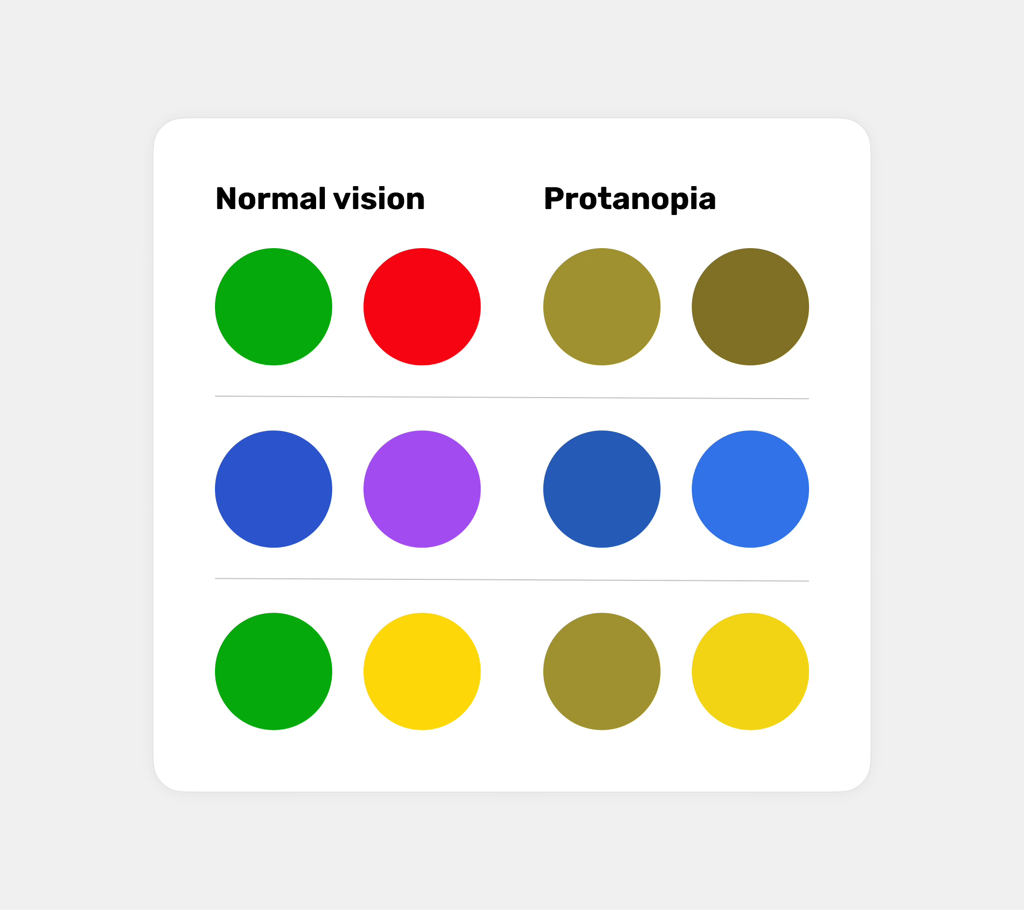
How do people with color blindness see the world?
To better understand the challenges faced by people with color blindness, it’s important to know how they perceive different colors and, in turn, how our project will look through their eyes. For a few selected basic colors, it looks like this:
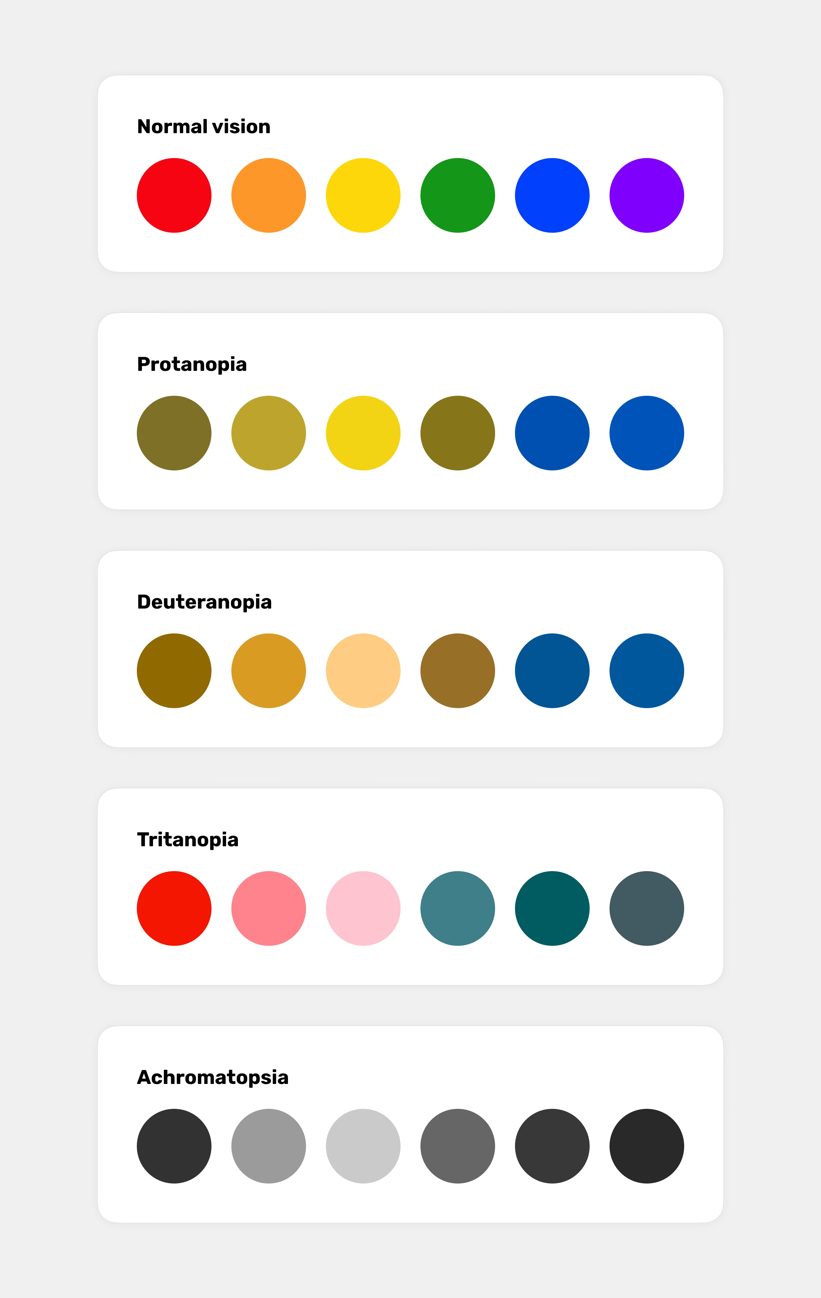
To better understand how the colors we’ve chosen are perceived by people with color blindness (and not only them), I highly recommend checking out the tool Who can use. It's a great tool that helps simulate how people with different vision disorders will perceive our chosen colors.
When color may not be enough
Now, let's get back to user interface design and take a closer look at situations where relying solely on visual cues based on color can significantly reduce usability or even make an interface unusable.
Of course, it’s impossible to list all the potential areas where understanding might be hindered due to the use of color alone. However, I hope this list will effectively guide you on what to pay attention to in the future and highlight the areas that could be challenging for individuals with color blindness.
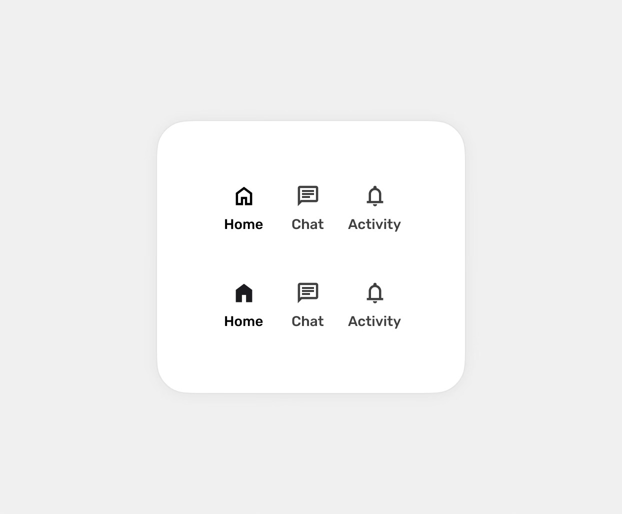
Interactions
The most basic category. Here, I’m referring to the states of interactive components such as hover, focus, active, and disabled. These states are most often distinguished only by colors, which either differ too little from one another or are chosen in such a way that they might be perceived as identical.
A basic example would be the states mentioned, e.g., for buttons, but also links, which may change color slightly when hovered over, making it difficult or even impossible to identify clickable elements, especially in the case of links.
The same applies to other components, such as dropdown menus or select boxes, where subtle hover or active states may go unnoticed due to their low contrast and poor differentiation from the background.
This also applies to all other components, such as switches, radio buttons, checkboxes, text inputs, selects, or sliders, which, if poorly designed, may make it difficult or impossible to distinguish their states and understand their interactions.
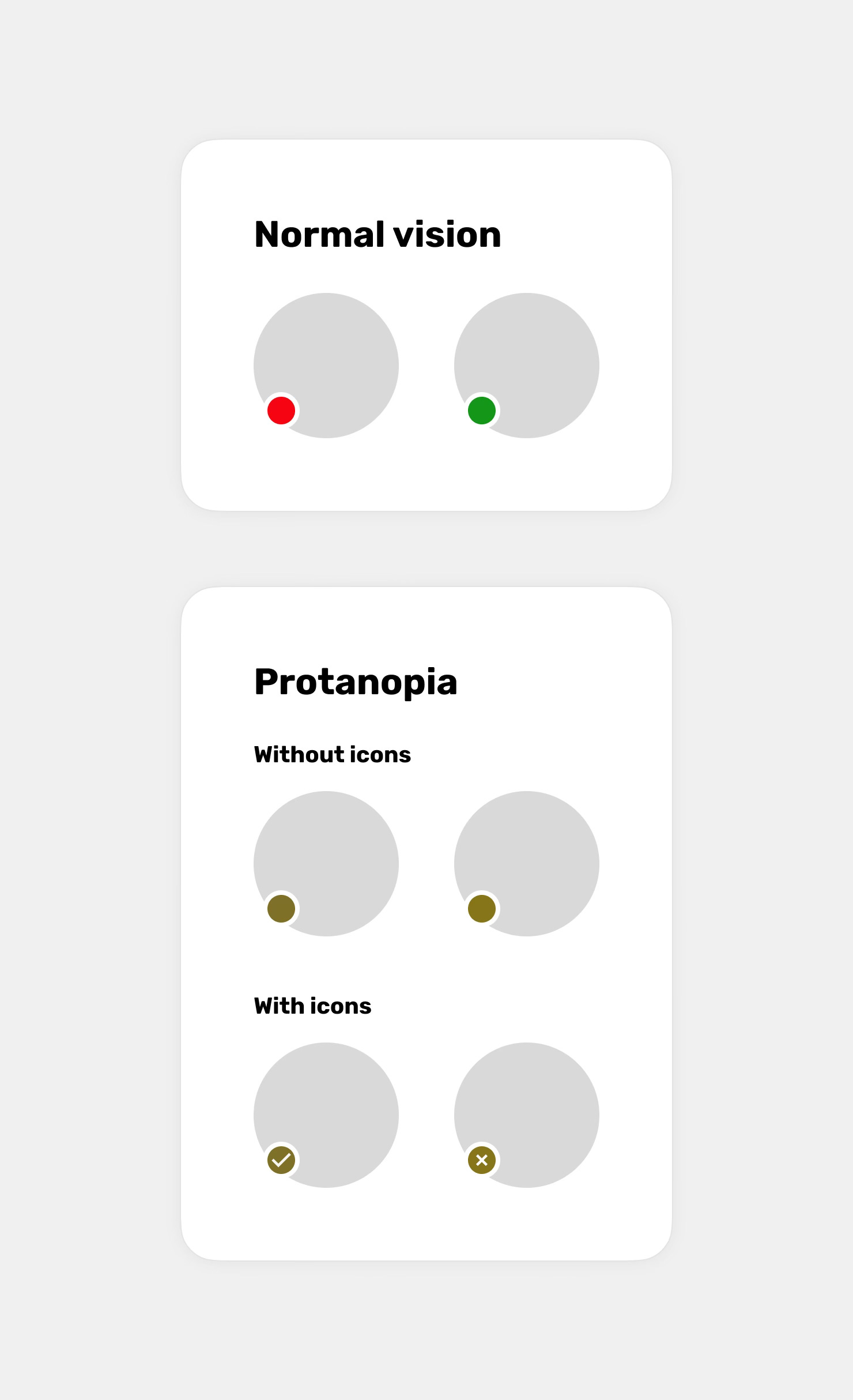
Notifications, statuses, and errors
We can include here all relevant feedback that is conveyed solely through color. This could involve success messages, warnings, or errors that differ only in color, as well as, for example, informing about a device's battery status by simply changing the color of an element without using percentage symbols or other indicators. A good example is also marking active and inactive users with indicators in different colors without using, for instance, an additional icon.
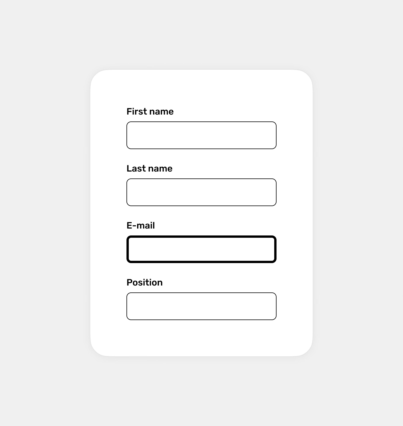
Forms
When it comes to forms, it will mainly involve marking fields with errors, for example, by simply changing the border color of the text field without additional messages or icons. Additionally, error messages may replace helper text, where only the color changes, which can make it difficult to notice the change. Of course, it will also include all the states of interactive form elements I mentioned earlier, such as marking the active field, hover, and focus states.
Navigation menu
Active elements in the navigation menu are indicated solely by a change in text and/or icon color without any additional visual cues. This makes it difficult for the user to determine which page they are currently on, as the elements do not stand out in a noticeable way. This also applies to situations where the marked and unmarked states are indicated by colors that, for some, may be similar or almost identical.
Maps
Most often, it will be segments and areas marked only with colors, without additional labels, icons, or textures to help distinguish them.
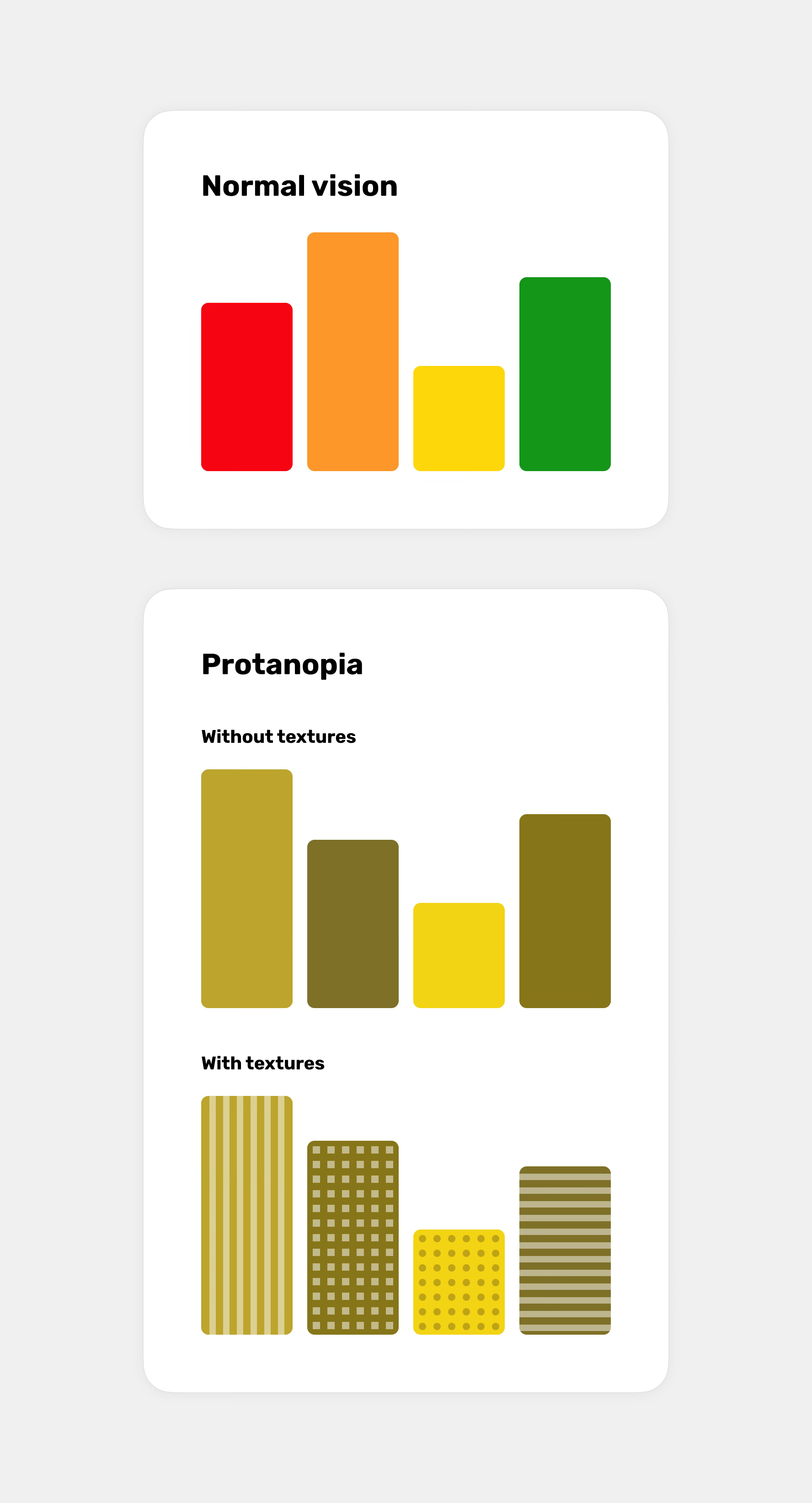
Charts, graphs, and statistics
When it comes to charts, we can include various categories or data distinguished solely by color. These often take the form of bars, lines, or, for example, pie charts that lack any additional distinguishing elements, such as textures or different line patterns.
Seat reservation systems
Any interfaces used for booking seats, such as in a cinema or on an airplane, where available, unavailable, and selected seats are distinguished solely by color.
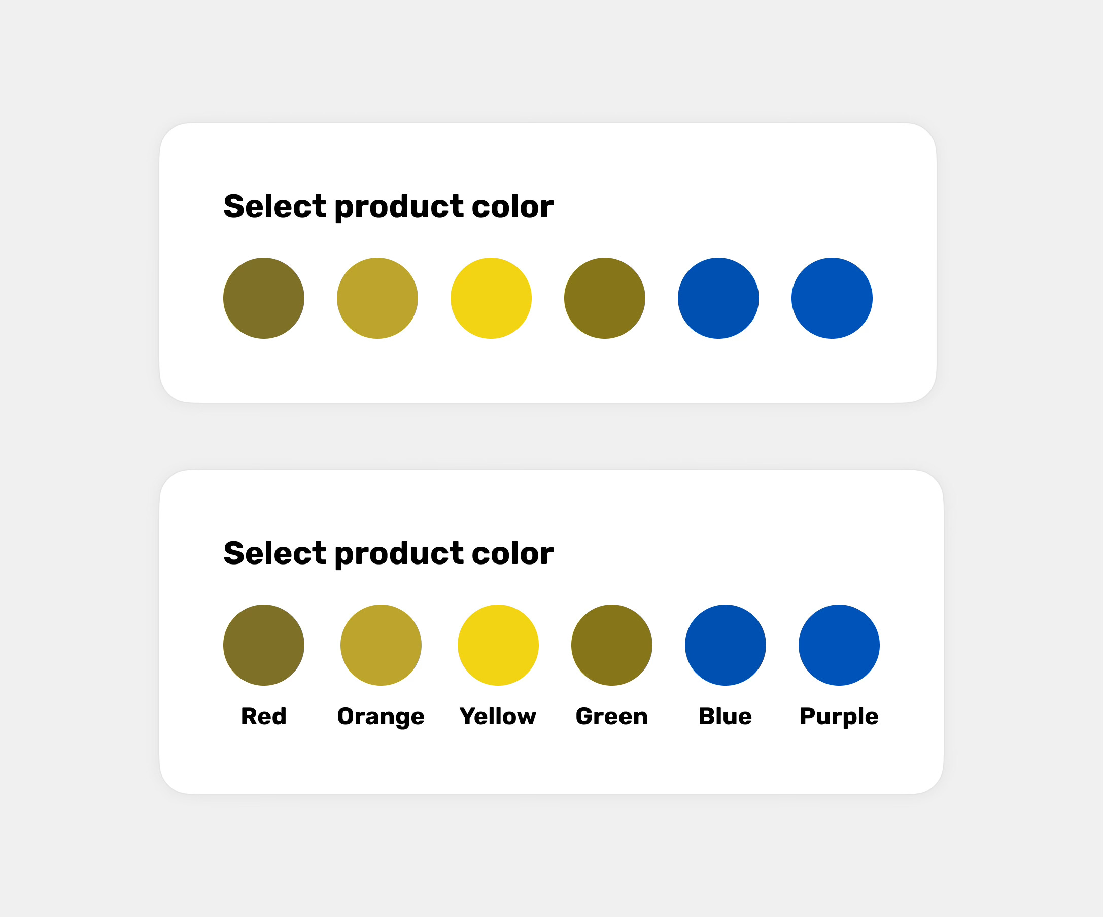
E-commerce statuses, filters, and products
Any statuses appearing in online stores that are marked and differentiated solely by colors. Most often, this refers to information about product availability. Additionally, a common mistake is the lack of extra labels when filtering by color. In online stores, a potential issue can also be the lack of textual information about the product's color, which cannot be correctly identified from the image alone.
Calendars and planners
In this category, the most common mistake will be events from different categories marked with colors but without labels or patterns.
Online quizzes and tests
The most common mistake is marking selected or incorrect answers only by changing the color of the element.
To-do list
A task list with assigned priorities or statuses, marked only with colors, without additional text labels or icons.
Better visual cues
So, if we've already identified the areas that might cause issues, let's now move on to the visual cues you can use apart from colors to ensure your designs are understandable for people with color blindness.
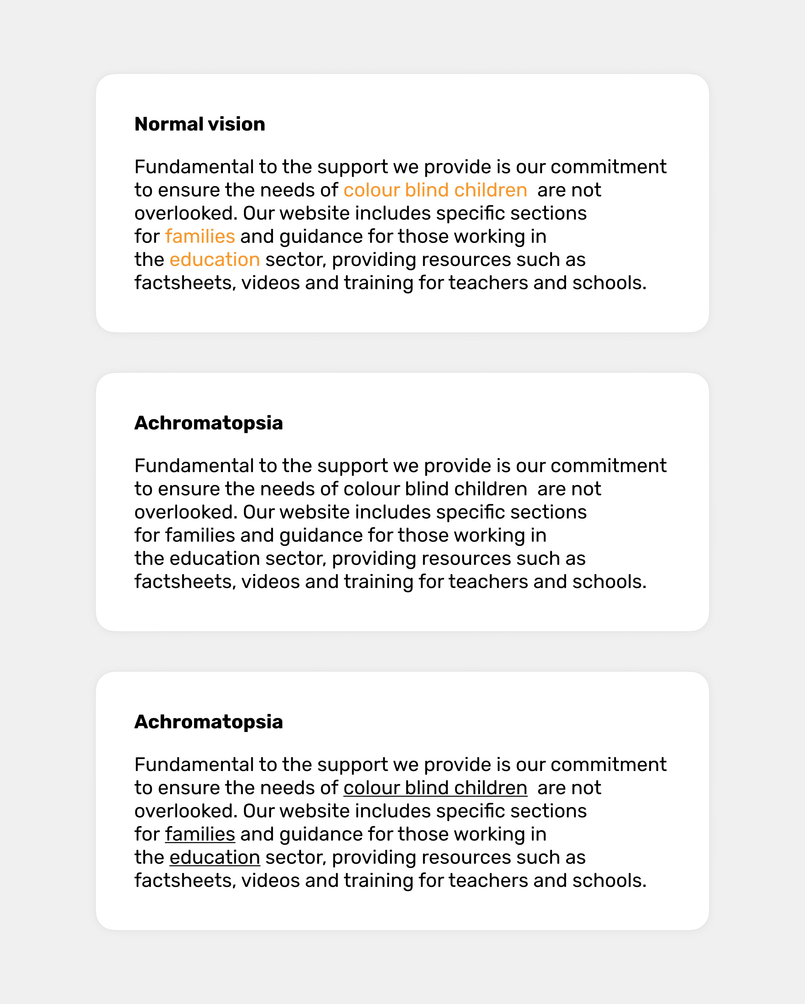
Text labels
Using labels allows users with color blindness to read important information, such as statuses or object properties, which are often indicated solely by color, making proper identification impossible for them. Labels can be very helpful, for example:
For task statuses or priorities, which are often marked only by color.
When providing information about a product’s color or filtering products by color.
In forms, to describe fields that are incomplete or contain errors.
When providing information about product availability.
When informing about battery status.
Icons
Using icons is just as important as using text labels. They help convey messages and system statuses more effectively. Adding appropriate icons to error and success notifications, as well as to statuses like user activity, which is often indicated solely by color, significantly improves interface comprehension for people with color blindness.
Patterns and textures
Using different patterns and textures is extremely useful when visualizing data on charts. Since they are easy to distinguish, users will have no trouble differentiating the visualized data.
Styles and thicknesses
A perfect visual cue is also the change in the thickness of elements or their styles. This is especially useful, for example, in a navigation menu containing icons, where the active element can be significantly distinguished from the others, making it easy to identify the current location. Changing the thickness also works well for text fields, where the border thickness changes in the active state.
Underlines
It often happens that links are not highlighted strongly enough. While this may not always be an issue for people with normal color vision, it almost always poses a challenge for individuals with color blindness. An ideal solution for making links stand out, especially in longer blocks of text, is to underline them. This ensures users can easily identify which parts of the text are clickable.
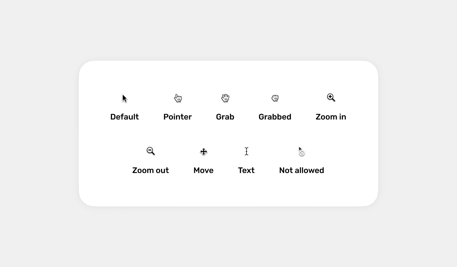
Cursors
Cursors inform users about what actions they can perform with the interface. For example, whether an element is clickable (pointer), draggable (grab), zoomable (zoom in and zoom out), allows text selection or editing (text), or if a specific action is blocked (not allowed). Most of the time, they work correctly; however, I’ve occasionally encountered situations where the cursor didn’t change its variant, such as when hovering over interactive elements, which can make it harder to identify them.
Animations
Subtle animations can help users understand changes in the interface. However, it's important to use animations sparingly and only where it makes sense, as an excessive amount of animations can be annoying and distracting for users.
Shadows
Using shadows in the interface can also help distinguish interactive elements from others. They can be applied, for example, to buttons, both in their default state and on hover.
Contrast
Using strong contrasts between elements can help distinguish them from each other. Make sure that important elements on the page are clearly differentiated from the others. For example, when grouping buttons, ensure that the primary button is emphasized strongly enough.
Proper contrast also applies to the use of appropriate colors, so make sure the contrasts comply with WCAG guidelines.
Avoid some color combinations
Although it’s not a visual cue other than color, it’s equally important. Some color combinations are particularly problematic for people with color blindness because they lack sufficient contrast and are too similar to each other. Examples of such colors include:
green and red
green and brown
blue andpurple
green and blue
light green and yellow
blue and grey
green and grey
green and black
Why is this important?
Accessibility
The role of user experience designers isn’t just to create beautiful interfaces and solve problems. We have a lot more to do, and one of the things that should be high on our list of priorities is ensuring accessibility. This means creating products and designs that are inclusive and do not exclude people with disabilities (including temporary ones).
Color blindness affects around 350 million people worldwide. Ignoring their needs means excluding a significant group of potential users. This not only makes their lives more difficult but also negatively impacts businesses and their reputation. It also doesn’t reflect well on us as designers.
Better usability
Colors are often used to convey key information, for example, in charts, alerts, or forms. For people with color vision disorders, these elements may be incomprehensible - but they're not the only ones affected. By designing with color-blind individuals in mind and following the above guidelines, we not only improve their experiences but, in many cases, enhance the experience for most users, as each of these guidelines can significantly improve usability, which also translates to business benefits.
Regulations and standards
Designing for people with color blindness is also important because, quite simply, it is often a legal requirement. Many countries have established digital accessibility regulations, such as the WCAG (Web Content Accessibility Guidelines).