
Introduction to Design Systems

How do large tech companies create such consistent and polished products? Can design and development teams effectively collaborate on large-scale digital projects? Is it possible to streamline the process of designing and building user interfaces?
If any of these questions ever nurtured you, the answer is waiting in this article. It’s a design system. Let's break it up together.
What is design system
A design system is a collection of reusable styles, components, and design patterns with documentation containing rules and guidelines for their use and the design of digital products within an organization.
The goal of a design system is to deliver a consistent user experience while reducing the cost and time required to design and implement. It also improves communication and design processes, which ultimately leads to more efficient and scalable development of products.
At large, mature organizations treat design systems as standalone products. They have dedicated teams of designers and developers, as well as a product owner, backlog, roadmap, and processes specifically for the design system. The primary users of the design system are designers and developers who work on products in the same organization.
Benefits of a design system
I've already mentioned some of the benefits of design systems, but let's take a closer look at what you can gain from having one:
Saving time and money, no need to design and implement the same elements multiple times.
Consistent and repeatable user experiences.
Scalability and efficiency.
Better cooperation between designers and developers.
Less effort to make changes, especially in design systems that use design tokens.
If we are creating a design system for an existing product, this is an opportunity to step back and audit the current solutions in terms of functionality and visuals.
Preventing project debt.
More efficient onboarding for new designers and developers.
It's important to remember that the benefits of implementing a design system come over time. It's not a solution that will instantly eliminate all problems and streamline an organization's operations.
When to consider building a design system
In every organization, the logic for creating a design system may be slightly different, but there are a few constant signals that may indicate the need to create one:
You are facing challenges with the lack of consistency in the delivered solutions.
You feel like you're having the same conversations about interaction, communication, and components over and over again.
Many teams in your organization work on the same product.
You want to eliminate or minimize design and technical debt.
You design multi-brand, multi-platform, and multi-theme products.
When it might not be the best idea – cons of the design system
Investing in a design system is a great idea for every organization that wants to provide a consistent user experience and operate more efficiently. However, for several reasons, it might not be the right moment to start implementing one. Here are a few important points that have to be considered before kicking off the work:
In order to bring real value to the organization, implementing, maintaining, and developing the design system requires an immense amount of time and resources, especially at the beginning.
Teams need time to learn how to work with it.
If it’s poorly implemented, a design system may limit creativity and the discovery of new possibilities for solving problems.
Convincing stakeholders to invest in a design system can be a challenging and time-consuming process.
Implementing a design system requires careful planning of the process. It is not something that we can start overnight.
It is also not worth implementing a design that serves a single low-complex project. In such cases, a simple style guide would do the trick.
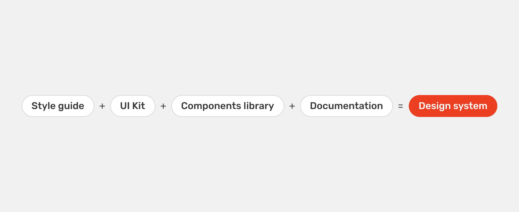
Design system? Style guide? UI kit? Components library? My head is spinning!
Let’s make it clear what a design system is not in the very beginning. We often hear that style guides, UI kits, or component libraries are called design systems. That’s a misconception. Let's define what each term stands for:
A style guide defines the overall look and feel of a product. It includes basic styles such as colors, typography, spacing, shadows, and rounding, as well as icons, tone of voice, and other elements that determine the product's appearance and feel.
A UI kit is a collection of user interface elements, such as buttons, text fields, and radio buttons, that can be used during the design process, for example, in Figma. UI kits are primarily created for designers and do not contain coded components.
Components library is a collection of coded reusable components that can be used by both designers and developers.
As you can see, none of these elements can be called a design system on its own. However, if you glue them together, they will become a design system. As I mentioned earlier, a design system is a collection of components and patterns that are designed and coded based on a style guide, along with documentation that specifies their use and principles.
Break it down for me - what's inside a design system?
People
Without a good and conscious team, creating a well-functioning system design will be impossible. People and communication are crucial. The team working on a design system should include UI/UX designers, front-end developers, and a person overseeing development, e.g., a product owner. Additionally, the team may include researchers, UX writers, back-end developers, and architects as support. The composition of the team depends on your organization's needs and available resources.
Foundations
Foundations are the basis of every design system. They contain typography, colors, spacing, grid, icons, tone of voice, and everything needed to define the look and feel of your product and the rules for using it. Foundations often include specifications of motion, accessibility, interactions, and design tokens.
Components
A collection of coded components built on top of the foundations. These include both basic components like buttons, radio buttons, and checkboxes, as well as more complex ones like cards, lists, and navigation, which can be built from other components.
Patterns
Patterns are reusable design solutions that don't necessarily have to be implemented as components (but they can be). They are most often guidelines for things like notifications, error handling, form building, and page layouts or templates.
Documentation
I talk a lot about documentation, but what exactly is it in the context of a design system? Documentation is an integral and essential part of any design system, providing information that enables the delivery of consistent and repeatable user experiences.
Documentation describes how to use the elements found in the design system, including good and bad practices. It also includes technical documentation of the components, such as spacing, sizes, and anatomy. This can be helpful during handoff as well as for other teams using the components. Documentation can also specify accessibility guidelines, user communication, and design tokens.
It is worth noting that the content of the documentation and the process of its creation should be tailored to your needs and capabilities. For example, it is not worth focusing on creating advanced documentation on UX writing when basic components and patterns are not described. Similarly, anatomy and technical documentation will not always be valuable. Talk to the people you are developing the design system with and its users. Learn what is needed at the moment for each area. Components and patterns may have both similar or significantly different documentation.
You can simply start documenting your design system straight in Figma. If you have more resources, try one of the design systems management tools, such as Zeroheight or Supernova. These tools combine design, code, and documentation. You could also use Storybook, a tool intended mainly for developers to store coded components
But that's not all
All the above elements are the basic and most common elements of the design system. However, depending on the organization’s needs and the state of the design system itself, you might want to enrich it with additional information, e.g., branding, marketing, resources, tools, and design processes.
It's worth noting that the above division of elements isn't the only correct one. We increasingly observe structures where basic styles are split into one group called design or styles, whereas foundations contain principles, goals, and vision, along with accessibility specifications.
It is worth getting acquainted with publicly available design systems and seeing how different companies approach the structure of their design systems. I included the best examples of such at the end of this article.
Atomic Design

Whenever you talk or write about design systems, it is impossible not to mention Atomic Design. An approach created by Brad Frost is the base of many design systems we know today.
This approach involves building systems from the smallest elements, i.e., atoms, and then moving to more advanced objects such as molecules, organisms, templates, and pages.
If you want to learn more about Atomic Design, start with this article.
Design systems you should know
Here is a list of design systems that I recommend checking out:
Useful resources
If you want to dive deeper into the world of design systems and stay up-to-date, I recommend the following resources:
The Component Gallery is a collection of components from the best Design Systems.
A frequently updated collection of design system examples, articles, tools, and talks.
An open-source checklist to help you plan, build, and grow your design system.
A collection of design systems for Figma from all over the globe.
Another constantly updated group of design system examples, articles, tools, and talks.
A design systems publication by Figma.
♻️ Share this article
If you found this post useful or entertaining, consider sharing it with one of your design or product management pals!
Tool of the week

Curve Text
Curve text is a plugin for Figma made by Lichin Lin, that allows you to bend your text into circle, square, or even arch shape.