
Improve your visual skills with Gestalt principles
#63 - How the human eye interprets what it sees

Welcome to Fundament, a bi-weekly product design newsletter where we share actionable tips and insightful stories with the worldwide design community. Join 2,100+ readers and grow as a UX and product designer with us!
Improve your visual skills with Gestalt principles
When it comes to visual design, I am a strong advocate for focusing on timeless concepts, understanding the fundamentals, and building on solid theory that is not influenced by fleeting trends. Of course, knowing current design trends is valuable. However, this knowledge alone does not give you the strong foundation you need to use those trends effectively in your projects and, more importantly, to design with intention and impact. One of these solid foundations is the set of Gestalt principles.
What are Gestalt principles
Gestalt principles are rules that describe how the human brain interprets and organizes visual information. They explain how we naturally group elements, recognize patterns, and form them into coherent wholes, even when they are incomplete or arranged in a seemingly random way.
These principles originated in the German school of psychology in the early twentieth century, based on the work of psychologists such as Max Wertheimer, Wolfgang Köhler, and Kurt Koffka.
Why is it important
In interface design, Gestalt principles are applied to how users perceive the interface and interpret its elements. This is crucial because it affects how the user understands the system and, in turn, its overall usability. These principles are essential for creating visual hierarchy.
They allow us to predict how users will interpret what we design. This helps us capture the user’s attention and support them in interpreting and understanding what they see. It also significantly reduces cognitive load, as users do not have to search for and guess which elements are related and which are not. When applied correctly, these principles enable the brain to automatically group elements and establish their hierarchy.
If these principles are ignored, the human brain will still interpret what it sees, but the interpretation will likely be inaccurate and inconsistent with how the system works, leading to frustration.
Although I refer to Gestalt principles mainly in the context of visual design, it is worth noting that they influence not only aesthetic perception but also user flow, the effectiveness of finding information, and decision-making.
In design, Gestalt principles can be applied in areas such as:
Page structure and information hierarchy
Navigation design
Forms and multi-step processes
Dashboards and data visualization
Examples of Gestalt principles
Let’s take a look at some of the most important principles and how they are applied in design. There are more of them, but I have chosen the ones I consider most relevant.
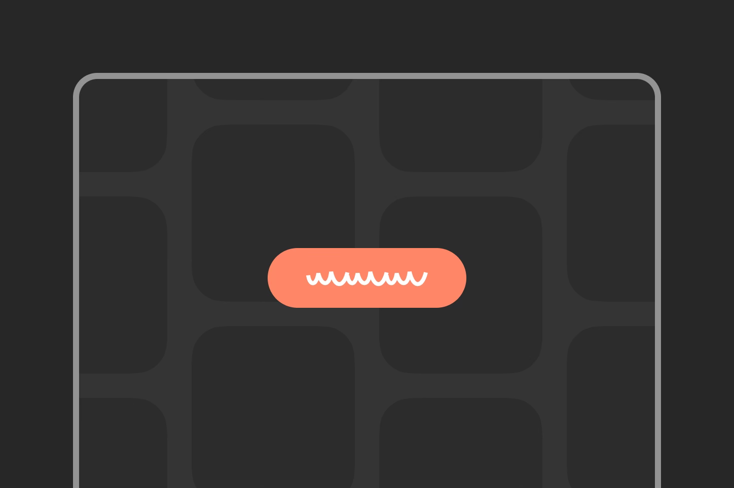
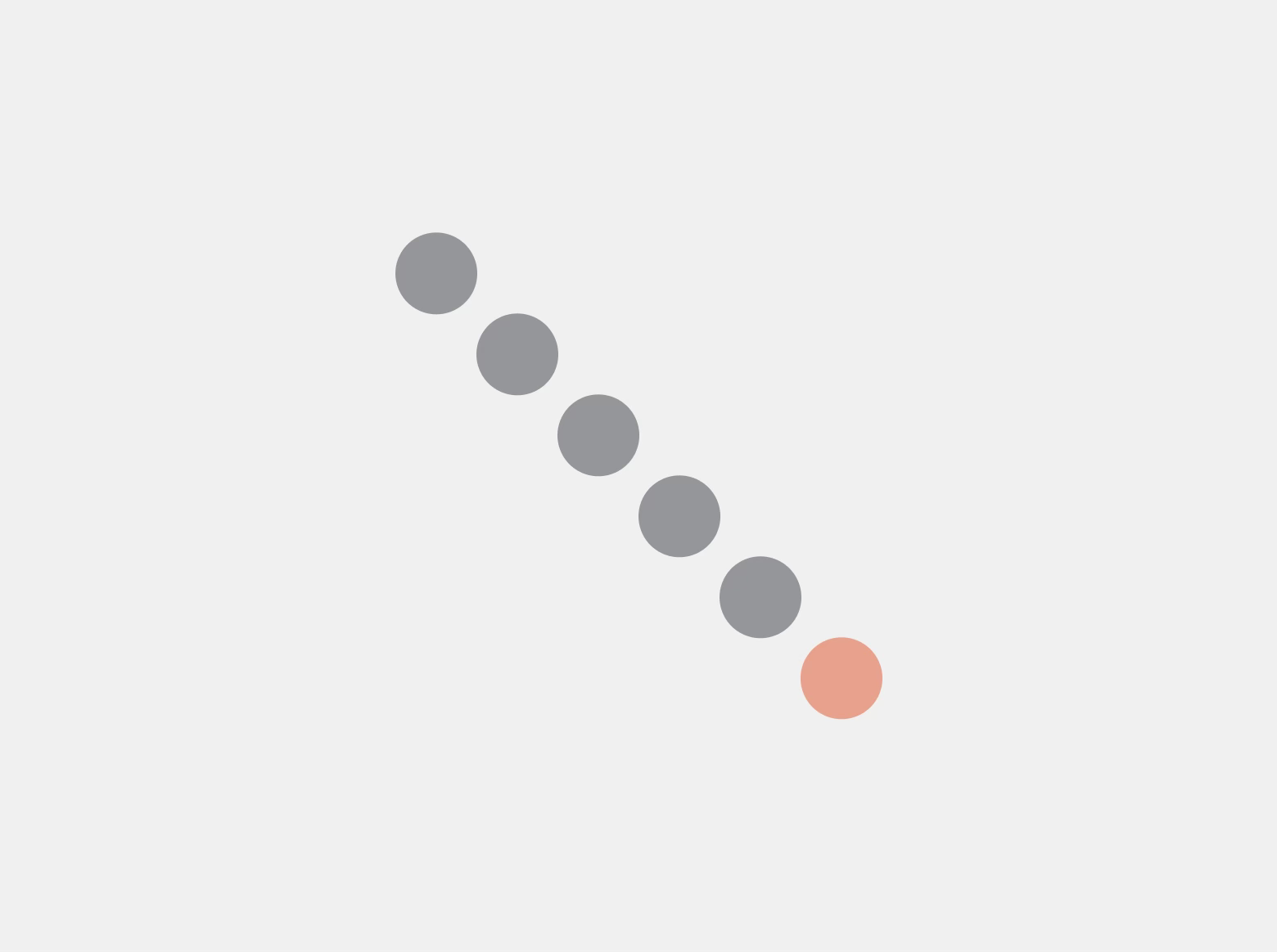
Closure
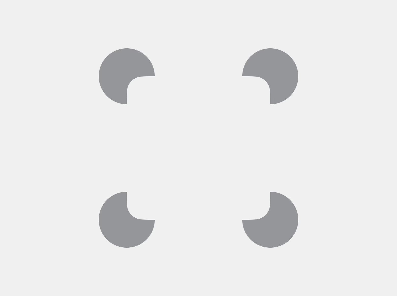
The principle states that the human brain automatically fills in missing elements in what it sees. This allows us to recognize shapes and patterns even when they are partially obscured or incomplete. It also helps reduce cognitive load, as it enables us to design elements in a more minimalist way while maintaining clarity for the user.
In design, this principle is often used in icons. For example, a trash bin icon can be drawn with just a few lines and still be recognized by the user. The same applies to a hamburger icon, where three lines form a coherent object. This principle is also commonly applied in logo design.
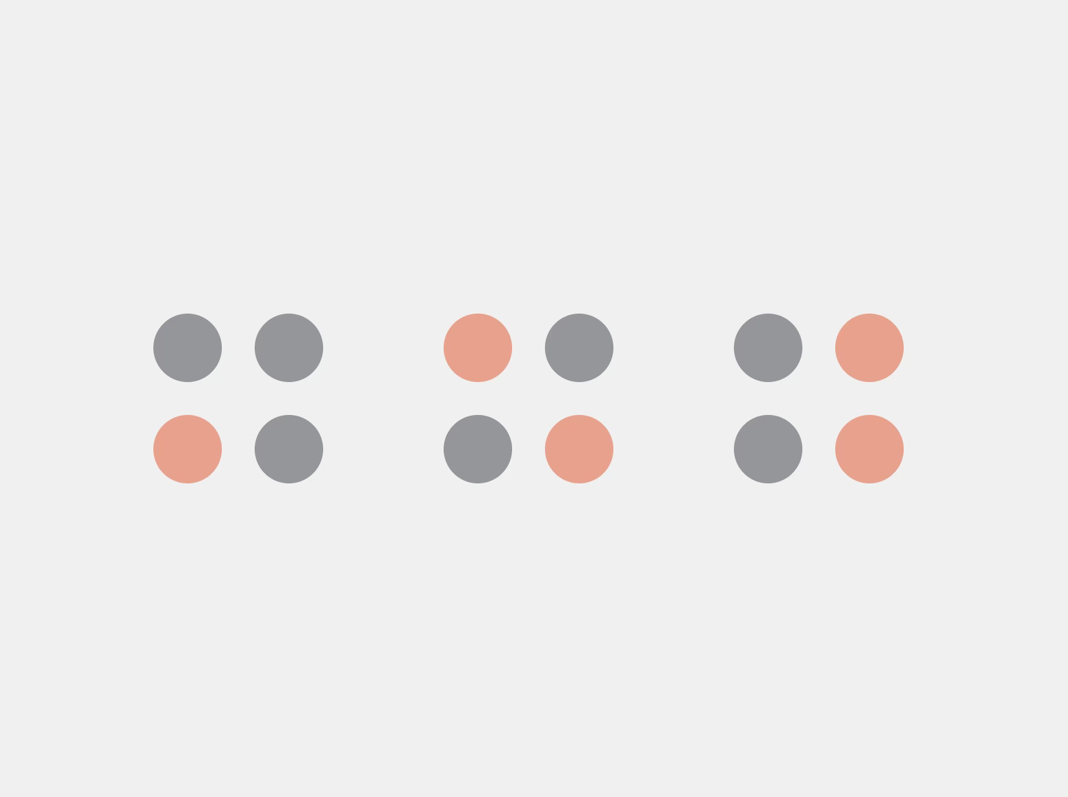
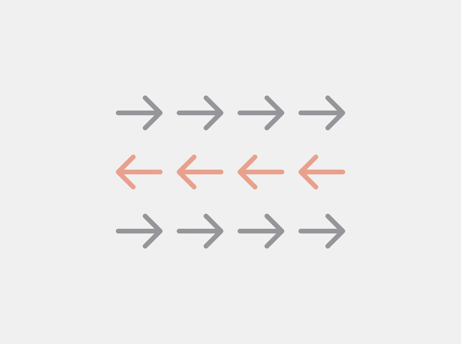
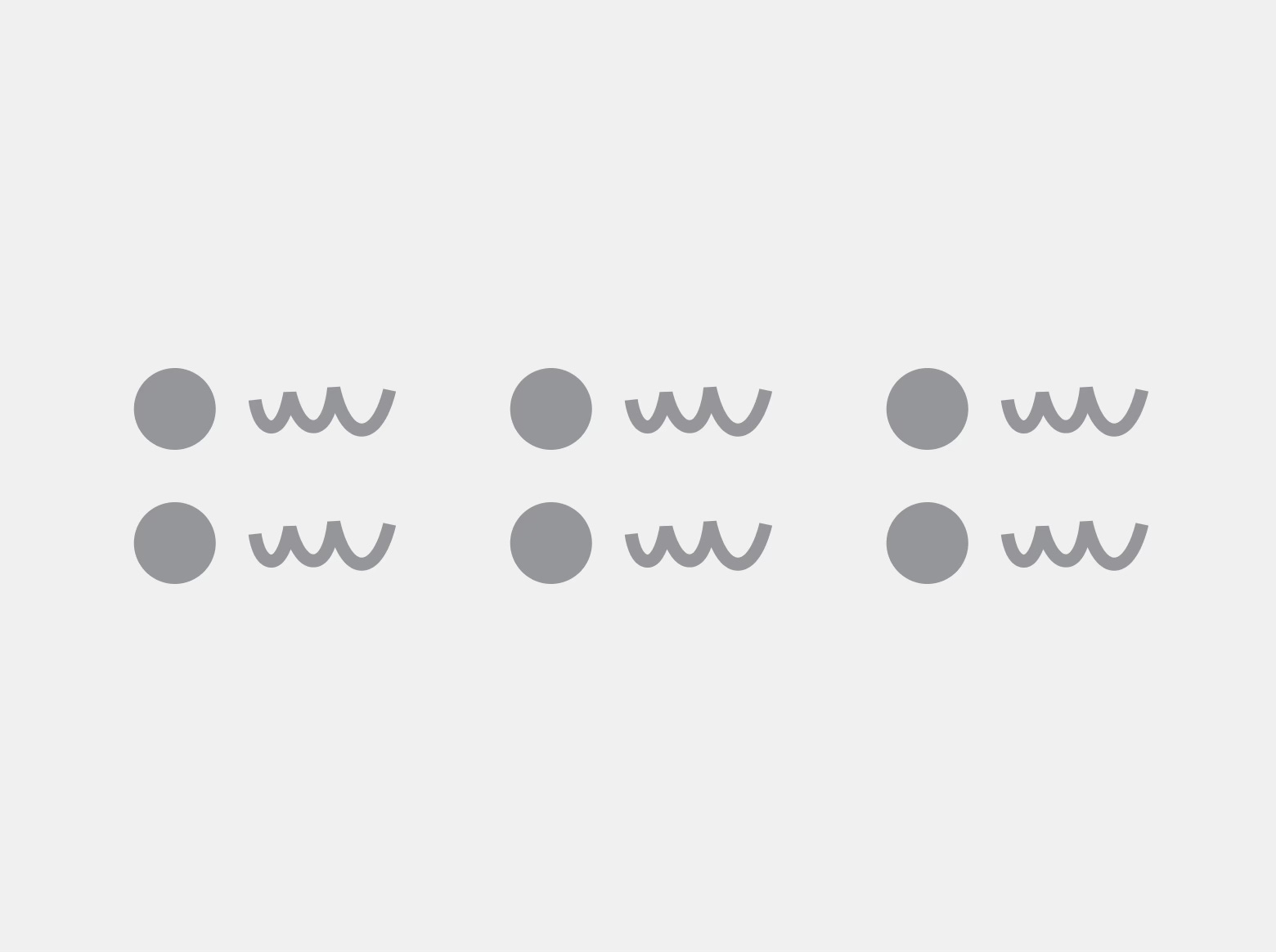
Similarity
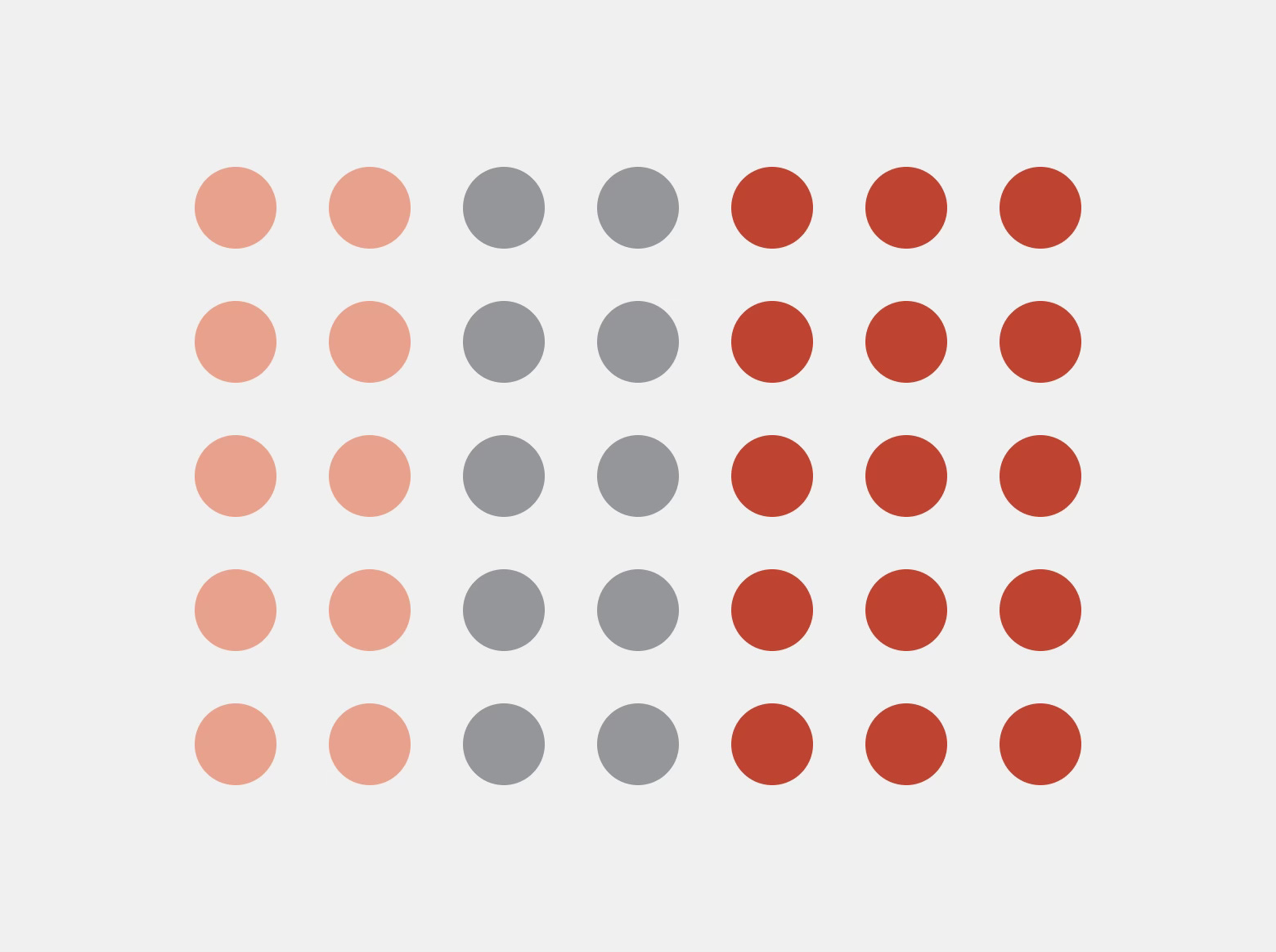
According to this principle, objects that are similar to each other are perceived as related or belonging to the same category. Similarity can refer to aspects such as color, texture, shape, size, orientation, or typeface.
In design, this principle is applied, among other things, when creating interactive elements. Clickable elements such as buttons should share the same color and shape, allowing users to associate specific visual characteristics with a particular action. The same applies to links of the same color, which are perceived as the same type of interaction, or to icons, where the same trash bin icon always represents deleting, and a left arrow icon indicates going back. This principle is widely used in the design systems.
Proximity
This principle states that objects placed close to each other are perceived as a group, even if they differ in shape or color.
In design, we use this principle to group related functions. An icon and the text of a button should be placed close together so that users perceive them as a single element, and the same applies to a heading and its paragraph. This principle also allows for creating sections and grouping objects, such as in lists, without using additional separating elements.
Continuity
People perceive lines as continuous and naturally follow them, even when they intersect with other elements, because they are seen as more related than elements arranged randomly. This is not always about literal lines, but also about visual paths created by the arrangement of elements.
In design, this principle is applied for example in forms, where fields arranged vertically create a natural flow of the eye from top to bottom. The same applies to navigation menus or breadcrumbs, where we follow the path defined by the elements. It can also be seen in line charts, where we follow a line even when it crosses other lines or the chart grid.
Common Fate
Elements that change in the same way, for example moving in the same direction or manner, are perceived as belonging to the same group.
In design, this principle is often applied in micro animations. Elements animated in the same way create a sense of consistency within the system and a feeling of belonging to the same group. This makes it easier to understand the same behavior in different contexts, such as loading animations, card swiping in a specific direction, or carousels.
Prägnanz

This principle states that people tend to perceive complex or ambiguous images in the simplest possible form. It helps with faster and easier processing of information. The principle of Prägnanz is also known as the principle of simplicity.
In design, we apply this principle by creating simple and clear interfaces. The human brain naturally seeks to minimize cognitive load, which is why structured designs with simple shapes, clear hierarchy, and sufficient spacing are perceived more positively and require less effort. When this principle is not applied, the brain will still try to simplify what it sees, but this increases cognitive load and can lead to misinterpretations.
Following this principle helps users better understand a product and navigate it more easily. A common example can be seen in icons and pictograms, where complex shapes are represented in the simplest possible way so that users can quickly recognize them. The same approach is also used in layouts, charts, and other forms of data visualization, which improves clarity and makes interaction more intuitive.
Figure-Ground
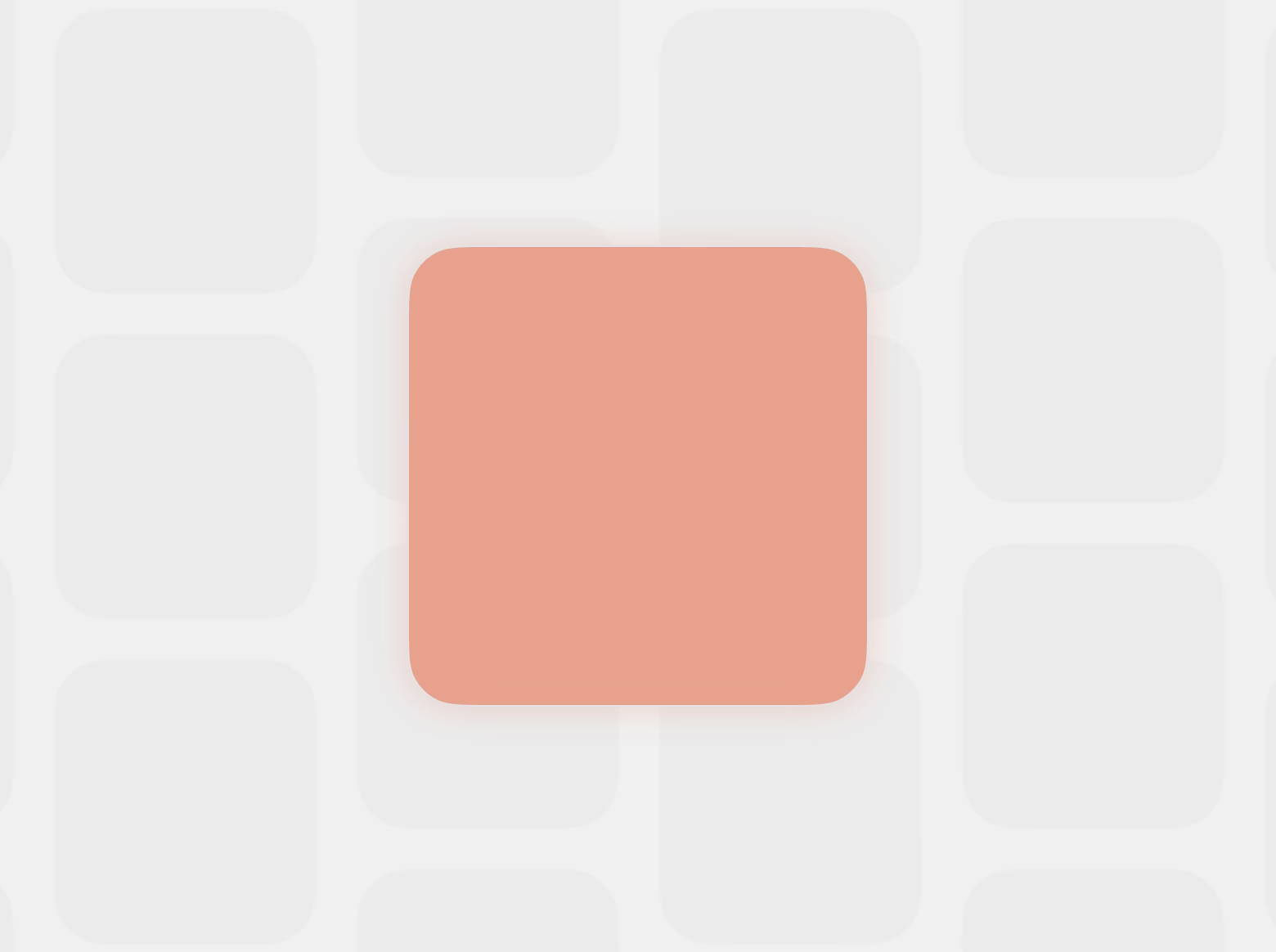
People automatically separate objects in the foreground from the background and focus their attention on them.
In design, we apply this principle by using contrast to clearly distinguish buttons from the background or by designing modals that stand out and capture attention. This ensures that users focus on the relevant elements in a given context. However, it is important to avoid highlighting too many elements at once, as this can make it harder for users to concentrate on the most important object.
Common Region
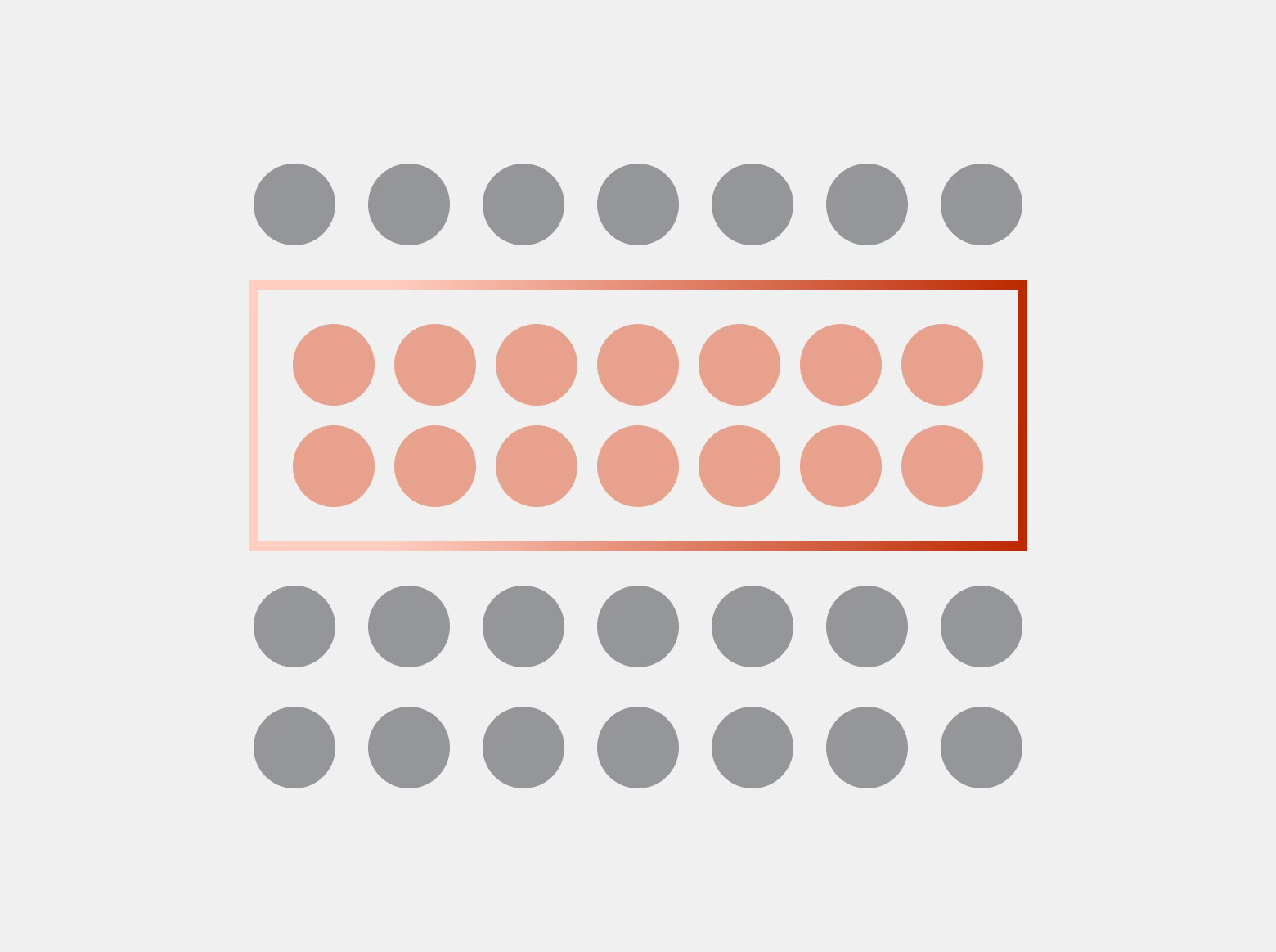
Elements enclosed within a visual boundary are perceived as a group, separate from elements outside that boundary.
In design, we can group related objects within a visually defined area, such as using a different background color, borders, shadows, or dividers, to show that they are distinct from the rest of the interface. This approach is commonly used on dashboards, lists, modal windows, and dropdown menus.
Symmetry and Order
People prefer organized and symmetrical layouts, which are not only easier to process but are also perceived as connected and forming a cohesive group.
In design, this principle is applied, for example, in grid systems that help maintain visual order. It applies not only to entire page layouts but also to smaller elements such as buttons, cards, and sections.