
Five Design Phrases That Need to Die
#34: The ketchup bottle meme did not make it to this list.

Over the past decade, I’ve stumbled upon a ton of design phrases and statements that were silly, absurd, or so stupid that it’s hard to believe they even exist. Because I wasn’t experienced enough, I didn’t immediately notice the level of stupidity for some of these. I even thought a few were legit pieces of advice. But not anymore. Here’s my list of the top five dangerous design phrases that need to die:

You don’t need a portfolio. Just drop a few screenshots into a PDF, and you are good to go!
Only designers can design.
Research isn’t important to having good UX.
Every function of the UI must be reached within three clicks.
Mastering Figma will instantly make a designer out of you.
Let’s explore each and try to debunk them.

Step into 2025 with a healthy dose of design knowledge!
For a price of 8 latte cups, you get:
Exclusive articles every month
Access to the full archive
Free access to Fundament Library (more titles to come in 2025)
Discounts on other educational content (2025)
Hurry! The yearly Premium plan is 35% off only until the end of January.
1. You don’t need a portfolio. Just drop a few screenshots into a PDF, and you are good to go!
Last year, I created a survey on LinkedIn asking about the most important skills of a UX Designer. I did that to test my hypothesis that empathy would be the one. Yet, people proved me wrong by picking problem-solving. Interestingly, nobody noticed I didn’t mention UI design or visual design at all.
Can you really throw a bunch of screenshots from your project into a PDF and call it a day? I don’t think so.
The visual side of things is important but not crucial. The main reason we, as UX and product designers, are hired is indeed the ability to create an elegant and simple solution for a complex problem we identified in the first place. If you just show the final piece and don’t tell any story about it, the recruiters won’t know much about your power to:
Adapt to ever-changing requirements due to the discovery of new facts while working on a long and complex project.
Design experiments to prove (or deny) a hypothesis before proposing the final solution.
Move business metrics with your design decisions.
Don’t get me wrong—beautiful pixels enhance the overall user experience. But if the thing is not intuitive, doesn’t solve any user pain, and isn’t sticky, you can’t say you did a great job.
2. Only designers can design
It happens to many of us, especially when we don't feel confident at the beginning of our careers. We think that if we were hired as designers, we would be the only people at the organization who could propose ideas, create sketches, and deliver mockups to the engineering teams.
That’s our job, right?
Well, not exactly.
Enabling non-designers to participate in the design process (if done correctly on the strategic level) has more positives than negatives. The first and most obvious profit is the diversity of perspectives. You will get more disparate and creative ideas when you include more people from other disciplines like PM, engineering, marketing, or data in your process. Your job then will be to synthesize them to make the best possible solution. It might not be your original idea. But this is absolutely fine. Our users don’t care who came up with all those brilliant notions as long as they are happy using our products.

Another advantage is the increased buy-in. When non-designers are included in the design process, they treat the project as their own. They will trust it (and you!) more and invest in it more, too. For example, PMs contributing to the design are more likely to advocate for the final product, resulting in higher chances of getting a green light from the stakeholders.
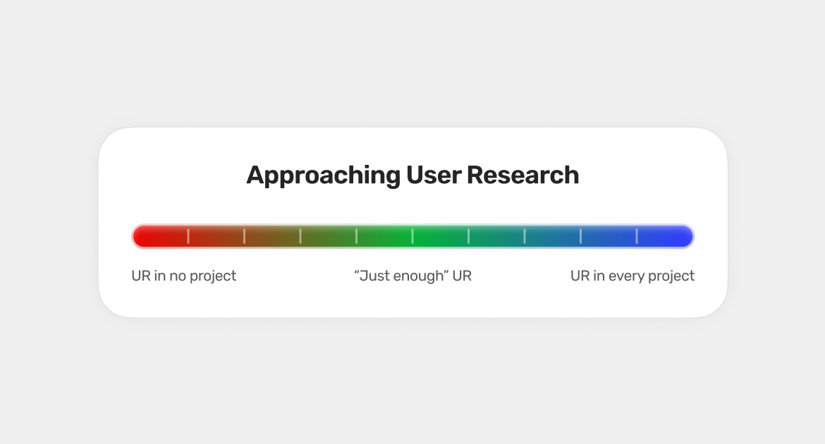
3. Research isn’t important to having good UX
There’s a whole spectrum of thinking about user research: you either don’t need it all, or you do it for every single initiative (at least, that’s what some bootcamp grads think before they land their first job in design). So, where’s the true laying? As always, somewhere in the middle.
I think the worst is being on the no-research-at-all end of the spectrum. When you remove the user research component completely from the design process, you can’t say you are doing UX design. Instead, you throw spaghetti against the wall and look at what sticks. Or, you don’t look at it. Do you even care what your users think? Do you care if you have users at all?
The user research component is so important for two main reasons:
On the strategic level, research helps identify stakeholders, define problems, and uncover competitive advantages.
On the tactical level, research helps validate our ideas and details about the solution from a usability perspective.
On the other hand (or the other end of the spectrum), if you spend time validating every single minor detail of your design, you are probably wasting lots of effort. Erika Hall, in her book “Just Enough Research,” discusses that too much and too complex research leads to analysis paralysis. What you really need is “just enough” research, which sometimes can be super simple and lead to very useful insights.
4. Every function of the UI must be reached within three clicks
In the early days of my design career, I heard this advice, and I thought it was legitimate. For every project I was working on, I was following this rule. But I have to eat crow and admit this is bullshit.
The first appearance of the term Three-Click Rule in literature was in Taking Your Talent To the Web: A Guide for the Transitioning Designer by Jeffrey Zeldman (2001). In his book, Zeldman links the Three-Click Rule with the usability of website navigation. He claims that users should find what they are looking for within three clicks, or they will move to a different website.
Although it may sound fair when you hear it for the first time, there’s a slight issue with this rule: no data supports it.
In fact, there was a study designed to debunk it:
In trying to complete the tasks, some users visited as many as 25 pages before they ended their task and others only visited two or three pages before stopping. If the Three-Click Rule came from data, we would certainly see it with this wide variation in the number of pages they visited.
The Three-Click rule does not make much sense for website navigation. People don’t leave websites where they must click more than three times to finish a task. Also, Joshua Porter’s study shows that user satisfaction does not depend on the length of the clickstream.
What’s essential from a product designer’s perspective is that applying this rule may be dangerous in complex enterprise systems, where some functions must remain intentionally hidden or where some user flows must be lengthy by design to prevent errors. That’s why we often use Progressive Disclosure to temporarily hide what’s not important at the moment.
5. Mastering Figma will instantly make a designer out of you
This is constantly coming back and forth to me, but I guess it has to be repeated countless times: Figma is just a tool. A nice one, but still, just a tool. Tools come and go. Where’s Dreamweaver now? Do you know anyone who would be designing a user interface in Photoshop? How many of your design friends still use Sketch?

Artiom Dashinsky, the author of many great books for product designers, such as “Effective Product Designer” or “The Path to Senior Product Designer,” coined the term Figmaism – an obsession with tooling at the expense of other (and often more important) skills. Many designers often forget about communication, collaboration, working with data, strategy, and ownership, instead discussing new and shiny Figma plugins.
If you are fresh to UX and product design, don’t rely purely on learning Figma. Instead, spend a healthy amount of time learning the core principles of UX design, studying some basics of psychology to understand why people click, and mastering Gestalt principles for graphic and UI design. It will much more likely make a better designer out of you.
How did you like this episode of Fundament?
😍 ・ 🙂 ・ 😐 ・ 🫤 ・ 😡